Design Opportunity
Insulin pumps are generally utilitarian in their design. Many popular models even look like pagers. We saw this as an opportunity to update the form and interface for an insulin pump concept.
Sketches to Solidworks
After a few paper sketches, we modeled several forms in Solidworks for physical prototyping.
Testing 3D Prints
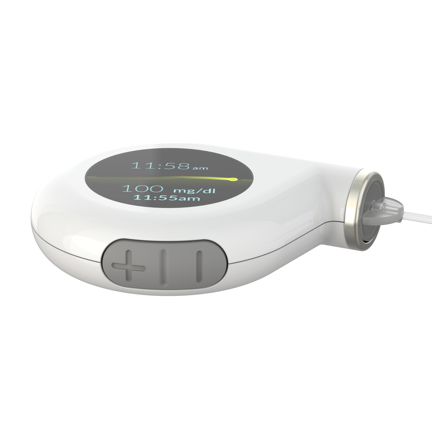
We asked people to hold and interact with a collection of 3D printed forms. This helped us to see what shapes people liked to hold in their hand and put in their pockets. It also gave us a good indication of where buttons might be placed on the form.
Interface Design
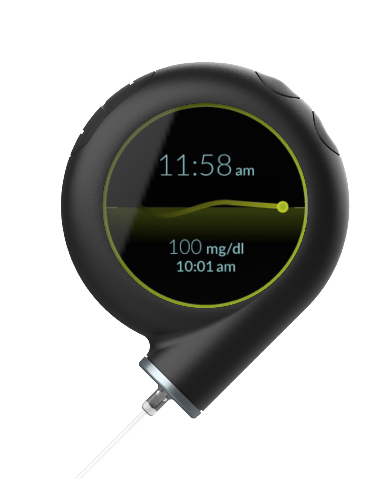
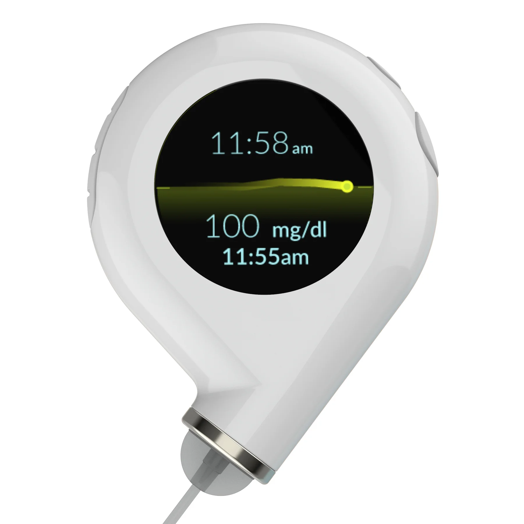
After interviewing several pump users, we focused on a few key features for the interface. The clock is the default screen. When you tilt the pump, it wakes up to show the graph. When your glucose is within target range for long enough a green ring illuminates on the edge of the display, giving positive reinforcement that you’re doing a good job of managing your blood sugar. We designed the interactive prototype in Illustrator and Adobe XD.
Final Form
The design features, such as shape and button location, were based on our findings in testing 3D prints. Robert Patterson lead design of the final form. He also designed a belt clip, mobile app layout, and continuous monitor.
Physical Model
I fabricated the physical model from a 3D print. It reflects actual physical dimensions, and fits a typical insulin cartridge.
Further Exploration
To further the learning exercise, I designed my own version of the final form in Solidworks. I wanted to think about incorporating primary components like the step-motor, chipset, battery, and insulin cartridge.
Team Members:


