Pelican Hard-Shell Wallet
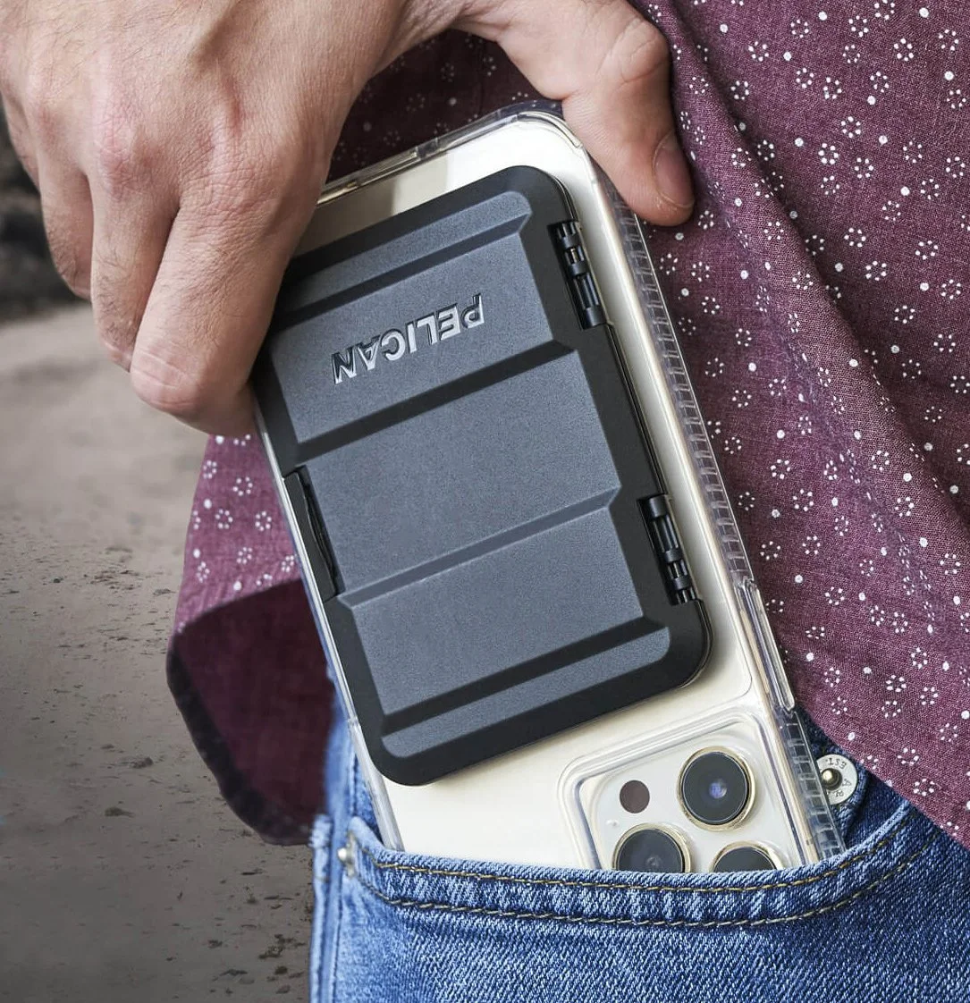
I designed the Pelican Protector and Protector Money Clip wallets. Both products are compact, tech-centric, Magsafe wallets featured in Pelican’s case lineup.
sketching / ideation
Pelican’s mission is to “protect all that you value”. As part of the visual language, I tried to come up with form concepts that were slim enough to live with, but maintained a burly look and feel. Many concepts use a “two band“ visual element which is consistent with a majority of pelican’s product lineup.
Prototype Development
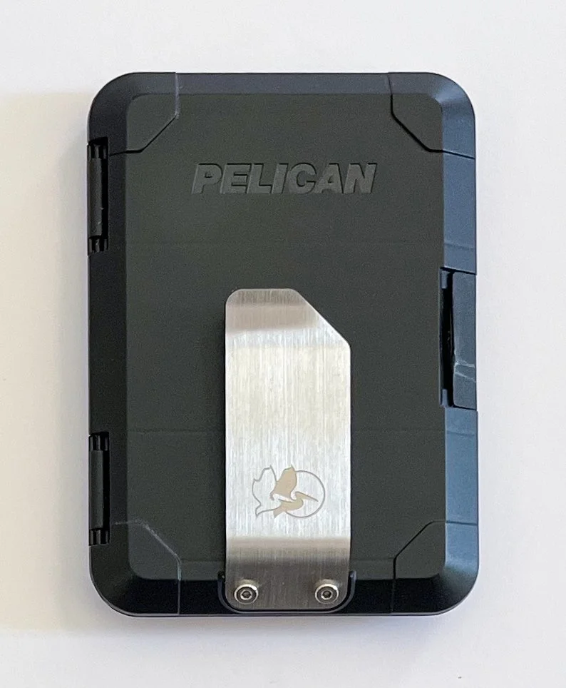
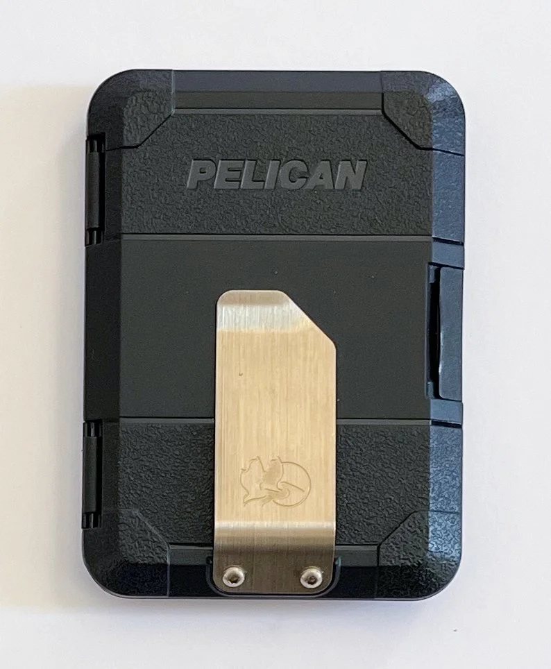
I went through several versions of the money-clip wallet, revising clip design, materials, and mold textures. The prototypes below range from painted 3D prints (left) to T0 and T1 prototypes (right).
I designed the standard and money clip wallet to fit the same base housing, saving manufacture costs.
Modular System
I came up with options for functional attachments. Here are designs for an airTag compartment and d-ring for attaching the wallet to lanyards and key leashes.


